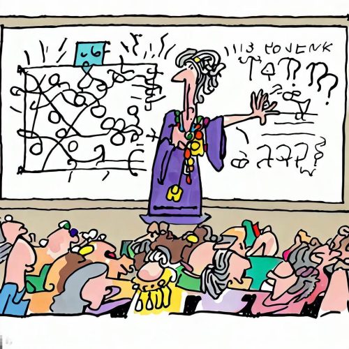
Categories
Blogging Coaching communication design Presentation storyfinding

How to Repurpose Content for Maximum Impact: The Power of the Story Arc

How can you tell one story across different channels without losing its essence or impact?

It can be so frustrating! You want to repurpose that story, but each platform has different requirements and audiences!

The answer is to start with the arc! Create a story arc to adapt your story to different formats, lengths, and audiences.

What’s a story arc?

A story arc is a structure with a beginning, a middle, and an end. It’s called an “arc” because it has a rising and falling action. The arc follows a clear progression of building up events and emotions and then winding them down toward the end.

The story arc can help you craft a compelling and coherent narrative that can be easily modified for different channels and audiences. For example, you can use the same story arc to create a blog post, a social media post, a video, or a podcast episode. You can also adjust the length of your story depending on how much time and attention you have from your audience.

How to create a story arc:

To create a story arc, you need to identify four elements:

  1. The Hook: Grab Your Audience’s Attention

    The hook is an opening sentence or paragraph that grabs your audience’s attention and makes them curious about your story. It should introduce the main topic, problem, or question that your story will address.

    For this blog post, the hook is the first line.
    “How can you tell one story across different channels without losing its essence or impact?”

  2. The Challenge: Create Tension and Emotion

    The challenge is the main obstacle or conflict you or your protagonist faced in your story. It should show what was at stake, why it mattered, and how it emotionally affected you or your protagonist.

    For this blog post, the challenge is “It can be so frustrating! You want to repurpose that story, but each platform has different requirements and audiences!”

  3. The Solution: Show How You Overcome the Obstacle

    The solution is the outcome or resolution of your challenge. It should show how you or your protagonist overcame the obstacle, what you learned, and how you changed.

    For this blog post, the solution is:

    “The answer is to start with the arc! You’ll want to create a story arc that you can adapt your story to different formats, lengths, and audiences.”

  4. The Takeaway: Share Your Main Point or Message

    The takeaway is the main message you want your audience to remember from your story. It should relate to your purpose, audience, and channel and include a call to action if applicable.

    For this post, a solution might be “Start with the arc!”

Use the Story Arc as Your Building Blocks

Once you have these elements, you can use them as building blocks to create different versions of your story for different platforms. Let’s use this blog post as an example:

  1. The Hook: Use it to create a headline or an Instagram caption

    I riffed on the hook to create the headline for this blog post. I might also use it for an Instagram caption or a Twitter post.

    Blog Title: “How to Repurpose Your Stories for Maximum Impact: The Power of the Story Arc”


  2. The Challenge: Use it as a video/podcast teaser

    If I was going to create a YouTube video teaser or a podcast episode, I might start by riffing on the challenge.

    Video Intro: “You want to repurpose one story across a variety of platforms, but dang it! Each platform has different requirements and audiences! What are you supposed to do?”

  3. Solution: Use it as a case study, LinkedIn post, or presentation

    If I was creating this blog as a case study or an instructional presentation, I might go straight to the solution:

    “To repurpose content that you can easily adapt to different platforms, start by creating a story arc. Here’s how…”


  4. Takeaway: Great for titles, rallying cries, and tweets

    I can always use a takeaway as a conclusion, a call to action or a rallying cry. I might even do a simple tweet on Twitter.

    “Want to repurpose content more easily? Start with the arc! Here’s how:”

By creating a story arc, you can more easily repurpose your stories for multiple platforms without losing their essence or impact. You can also create a consistent brand message across different channels and audiences, which can help you build your authority and reputation online.

I think you can see how this blog post is going to end! I’ll give you a final rallying cry for repurposing content:

Start with the arc!


Laura Bergells teaches public speaking and business communication classes and workshops. Hire Laura.

Take Laura’s communications and public speaking classes at LinkedIn Learning.  – Free to LinkedIn Premium Members! 


Categories
Coaching design PowerPoint Presentation public speaking

How to Turn Your Pre-Presentation Anxiety into Your Secret Friend

We’ve all been there. You’re about to give a presentation and you feel your heart racing, your palms sweating, and your stomach churning.

hello butterflies, my old friends! 🦋

You might think that the best way to deal with this anxiety is to get rid of it. To calm yourself down, to breathe deeply, to tell yourself it’s not a big deal.

But what if I told you that your anxiety is actually a good thing? That it’s a sign that you care about your topic and your audience? That it’s a source of energy and motivation?

That’s right. Your nervousness is not your enemy. It’s your ally. It’s there to help you perform better, not worse.

So instead of trying to overcome it or beat it into submission, why not embrace it? Why not say hello to it and thank it for showing up?

Try this: Next time you feel anxious before a presentation, say something like this:

“Well, hello there, my old friend anxiety. What are you here to teach me today?”

Maybe it’s there to remind you to do more research on your topic.

Maybe it’s there to encourage you to practice more. Maybe it’s there to boost your enthusiasm and excitement for your audience.

Whatever it is, listen to it and learn from it. Don’t let it scare you or stop you.

Befriend your butterflies so that they work FOR you, not against you!


Laura Bergells teaches public speaking and business communication classes and workshops. You can also book a private, one-one-one Zoom consultation with here: Hire Laura.

Take Laura’s communications and public speaking classes at  LinkedIn Learning.  – Free to LinkedIn Premium Members! 

Categories
Coaching communication design Education Presentation public speaking storyfinding

How to Hook Your Audience: In Medias Res

Picture this: You’re on stage, telling a story about the night you became a criminal. You say:

I’m lying in wet grass behind a cow barn. I just vandalized a property. Two angry men are hunting me down. My heart is pounding. I’m thinking, ‘I’m a mom of two. What am I doing here?

Boom! You’ve got your audience hooked. They want to know more. They’re on the edge of their seats.

You’ve also just used a storytelling technique called in medias res.

What is in medias res?

In medias res is Latin for “in the middle of things”. It means starting your story in the middle of the action, instead of at the beginning.

Why use in medias res?

En medias res can make your story more exciting and intriguing. It can spark curiosity and suspense in your audience. It can make them wonder:

  • What’s going on?
  • Who’s the speaker?
  • How did they end up in this situation?

Then, you can go back to the beginning and fill in the gaps.

How to Use In Medias Res

You don’t have to use in medias res for every story. Sometimes, it’s better to start at the beginning and build up to the climax.

But if you want to add some excitement to your story, try starting in the middle. Here are five tips for using in media res effectively:

  • Choose a moment that’s dramatic, surprising, or funny.
  • Make sure it’s relevant to your main point or message.
  • Don’t give away too much information at once. Keep some mystery.
  • Use sensory details to make the scene vivid and realistic.
  • Let your audience know that you’re safe and that everything turned out okay.

Experiment with in medias res and see how it changes your stories. You might find that it makes them more engaging and memorable!


Laura Bergells teaches public speaking and business communication classes and workshops. Hire Laura!

Take Laura’s communications and public speaking classes at LinkedIn Learning – Free to LinkedIn Premium Members!

Categories
Coaching communication design Presentation public speaking storyfinding

How to Make Your Stories Sizzle with Tense Choices

Imagine this: You’re on stage, telling a story about your wild past. You say:

I’m lying in wet grass behind a cow barn. I just vandalized a property. Two angry men are hunting me down. My heart is pounding. I’m thinking, ‘I’m a mom of two. What am I doing here?

Sounds thrilling, right? You’re using present tense to make your audience feel like they’re there with you.

But what if you said:

I was lying in wet grass behind a barn. I had vandalized a property. Two angry men were hunting me down. My heart was pounding. I was thinking, ‘I was a mom of two. What was I doing there?

Not so exciting, huh? You’re using past tense to distance your audience from your story.

Why Tense Matters in Storytelling

Tense is the verb form that shows when something happens: past, present, or future.

Tense can affect how your audience feels about your story. Here are two tips to help you choose the right tense for your stories:

🔥 Use present tense to create urgency and excitement. Present tense makes your story feel like it’s happening right now. It draws your audience in and makes them feel the emotions you felt.

🧊 Use past tense to create calmness and detachment. Past tense makes your story feel like it’s over and done with. It gives your audience some space and lets them observe your story from a safe distance.

How to Choose the Right Tense for Your Stories

There’s no hard and fast rule for choosing the tense of your stories. It depends on your purpose, your audience, and your style.

But here are some questions to help you decide:

  • Do you want to make your audience feel like they’re part of your story or just watching it?
  • Do you want to make your audience feel more or less emotional?
  • Do you want to make your story sound more or less realistic?

Experiment with different tenses and see how they affect your stories. You might be surprised by how much difference a verb can make!


Laura Bergells teaches public speaking and business communication classes and workshops. Hire Laura!

Take Laura’s communications and public speaking classes at LinkedIn Learning – Free to LinkedIn Premium Members!

Categories
communication design PowerPoint Presentation video

6 Tips on Using Color in Slide Design.

using color in slide design

Color choices on your slides are important. People react to color on both a physical and emotional level.

Often, we see color on PowerPoint slides that don’t seem to have a purpose. Or worse, the color undermines the emotional intent of the message. Sometimes, setting constraints or following basic rules on colors can help you make better color choices.

Here are 6 quick tips that cover the basics of using color in slide design.

1. Use bright colors to attract + stimulate. Don’t use color merely for decoration. Use it for a purpose like drawing attention or setting a mood.

2. Use muted colors for reflection + contemplation. You don’t want to be in “attraction + stimulation” mode all the time. Think about the emotional content of color and how it can enhance learning outcomes.

3. Be careful about using too much color on one slide. It can be confusing. Remember the design concepts of contrast and sameness: without balance, you can create clutter and chaos.

4. Beware of bevels, gradients, and red text. They can be hard to see.

5. Check contrasts for accessibility. For those who are color blind or have photosensitivity, some colors may be difficult or impossible to see. Check contrasts at https://webaim.org/resources/contrastchecker/

6. Consider a limited, coordinated color palette. Pick one that meets your needs here: https://color.adobe.com/

What’s your fave quick tip for using color in slide design?


Laura Bergells is a professional story finder. She writes, coaches, teaches, and speaks. Check out her online courses at LinkedIn Learning.

If you’re a LinkedIn Premium or Lynda.com member, these courses are free! If you’re not a member, you can either become a member or buy each of these classes à la carte.

Categories
Blogging Coaching communication content ideas design Education PowerPoint PowerPoint Presentation Presentation public speaking social media Twitter video

How to transform presentation content into video social media posts

Here’s a question about presentations and videos I started to get a lot last month. I’ll paraphrase it:

Hey Laura. How do you do those square, short, silent little videos that you share on LinkedIn and Twitter?

The answer is: really easily! I use a tool called Canva. Update: And here’s a direct link so you can use Canva to create presentations and slides.

As a stand & deliver trainer, I have oodles of presentation content. Canva lets me repurpose bits and pieces of this content for easy social media sharing.

Yes, Canva excels at quick online video creation. I’m finding a lot of people use Canva — but we tend not to think of using it for video. We tend to think of it for images.

I’m also thinking a lot of people have PowerPoint presentations. Why not try using Canva to repurpose your presentation content for social media posts?

Canva lets you do this in a way that’s super easy to accomplish. I show you how in this two minute video. Enjoy!


Laura Bergells is a professional story finder. She writes, coaches, teaches, and speaks. Check out her online courses at LinkedIn Learning.

If you’re a LinkedIn Premium or Lynda.com member, these courses are free! If you’re not a member, you can either become a member or buy each of these classes à la carte.

Categories
Coaching communication design PowerPoint PowerPoint Presentation Presentation public speaking

Never end your presentation with Q&A.

Never end your presentation with a Q&A.

Got that? Don’t end your next presentation by saying, “Any questions?”

There’s no need to announce that it’s time for questions and answers.

You can do better.

Always plan a strong closing.

If you’re planning a Q&A session, you can have it near the end, but not at the end.

Answer audience questions, then deliver your closing statement.

Don’t risk letting your super awesome presentation drift off into whatever might be on the mind of the last person who asked a question.

Wrap it up, partner. Put a bow on that presentation. 🎁

Consider this: I cover five strong closing techniques in my public speaking foundations course on LinkedIn Learning.

The full course is one hour. It’s a great resource to revisit before your next big speech or presentation, free for LinkedIn Premium Members.

Check it out. >>> http://linkedin-learning.pxf.io/JAb4N

Categories
communication design

Do we need business cards any more? Really?

I’m going to save a tree. I’ll stop handing out business cards.

Do we really need business cards anymore?

I find that when I go out to meet people, I’m more inclined to exchange LinkedIn information. Other people I know exchange electronic contact info to stay in touch. 

When someone tries to hand me a business card, I usually try to ward them off. I know I’m only going to throw it away later. It seems like a waste.

My compromise solution for next year is to only order a few cards. If someone demands one and I deem it necessary, I can hand one out. I’ll keep an eye on how many I hand out, and try to whittle it down to zero.

I’m thinking business cards may just be a bad habit that I need to break for the new year. Business cards seem like a holdover habit from a bygone era.

Or is there a compelling case for business cards that I’m not grasping?


Laura Bergells is a professional story finder. She writes, coaches, teaches, and speaks. Check out her online courses at LinkedIn Learning.

If you’re a LinkedIn Premium or Lynda.com member, these courses are free! If you’re not a member, you can either become a member or buy each of these classes à la carte.

Categories
design PowerPoint Presentation

Slide Design: Try this ‘Simple’ Game…

I love working with talented professional designers. They can help you create slides that not only look beautiful, but really help enhance your presentation.

However, most of the time, I don’t have the luxury or budget to hire a design team to produce my slides. For many business presentations, slide design becomes a do-it-yourself effort.

When designing slides, I need to remember my limitations! I’m not a professional designer, so I need to keep my slides simple. And as luck would have it,  simplicity makes for great slide design.

Stingy Design Restrictions

Ironically, simplicity isn’t as simple as it sounds. It often means using restraint. Holding back can be really difficult when you’re using slideware that offers you zillions of design options. Like a kid in a toy store, you can be tempted to play with all these distracting features — and forget to connect to your audience with solid content and excellent presentation skills!

And that’s a key concept when designing with simplicity — avoiding distractions. When you approach your slideware, try playing this eye-opening little game. Start by giving yourself some very restrictive rules.

To begin, let me give you a set of design rules that may seem really harsh. Remember, think of this as a game. Your goal is to design your presentation using 5 very spartan rules:

  • Use 1 font types and 2 font sizes, max.
  • Use black, white, and grey: no color on your slides.
  • No bullet points or 3D.
  • No more than 10 words on any slide.
  • No pre-packaged design templates, clipart, animation, & transitions.

That’s pretty harsh, right? Go ahead and give it a try. You’ll find that giving yourself some very restrictive rules can really open up your creativity. You may or may not like the way this presentation looks in the end, but this is only round one of the game. Save your presentation, and let’s try round two.

Open up your B&W presentation, and save it as another name — maybe something with Part 2 in it. Now, let’s loosen up the rules a bit. This time, you can follow these 5 rules, instead.

Loosen Up Design Rules

  • Use 2 font types and 3 font sizes, max.
  • Only one color other than black, white, and grey.
  • Use up to 3 bullet points — but on one slide only.
  • No more than 14 words on any slide.
  • No pre-packaged design templates, clipart, animation, & transitions.

That’s only a little less harsh, right? But notice what happens when you start from a place of restriction and gradually open yourself up to a few new features. You’ll start to see what’s really essential — and what might be distracting.

This approach is almost in direct opposition to what we see with most slideware. Instead of giving yourself access to every tool in your design toolbox, start by limiting yourself. Gradually, add a few techniques in each iteration.

For your third and final iteration, go a little crazy. Open up your design restrictions to these rules:

  • Use up to 2 font types and 3 font sizes.
  • Use unlimited amounts of color on your slides.
  • Limit yourself to seven bullet points on three slides.
  • You can put up to 20 words on any slide.
  • Still no pre-packaged design templates, clipart, animation, or transitions.
Go nuts with design

photo by Euromagic

Try this exercise. You’ll discover some surprising insights when you do. You may even find that you like your black and white presentation so much, you’ll be inclined to keep it!

Remember, simplicity is often best in slide design. You may feel that it’s impossible to keep to the stringent rules I’ve outlined. But, your mind will love a creative challenge. And remember that giving yourself design limitations may help you design a more polished presentation.

Categories
design fun PowerPoint Presentation Presentation

Three vital presentation lessons learned…from a walk in the woods

For close to two decades, I take an almost-daily walk near my office. It helps the creative process to get out and clear my head. My office is located in an old forest. A creek runs through it, creating a sizable gully. I’ve seen deer, coyotes, rabbits, and all sorts of birds on my constitutional.

As one of the more civilized creatures, I walk on the sidewalk that cuts through the forest. No sense muddying my shoes on the way to and from work.

A few weeks ago, something new caught my eye on my daily walk. Someone had crawled down into the depths of the gully to place a red sign on a tree. The bright red spot caught my eye and raised my curiosity.

Sign from the sidewalk
The sign, as seen from the sidewalk

Squinting, I gathered that there were words on the sign. However, the sign was too far down the hill for me to read. An innately curious person, I simply had to know what the sign was trying to communicate. In a typical January, the forest would be filled with drifts of snow, making it near impossible for me to get close to the sign. Even so, the forest floor was filled with slick leaves, so I half slid down the gully to get a closer look. Halfway down, I snapped another photo:

Sign, halfway down the hill, with zoom.

Curses! I still could not read the sign. Determined, I continued to slide down the hill until I got a few feet away from the tree.

No Hunting or Trespassing.
I'm going to be prosecuted.

I felt entrapped. Twenty years, and I never once think to wander down a steep hill to go into the forest. A bright sign inflames my curiosity, and boom. I’m a trespasser.

Vexed, I trudged back up the slippery hill. A Pileated woodpecker gave me a stern lecture, then banged his head on a rotted tree top. The judge banged his gavel. I had been dismissed. Case closed.

What three presentation lessons had I been reminded of from my foray into the forest?

The unexpected will rivet audience attention. Breaking a pattern is a very basic way to grab attention. I was accustomed to seeing only forest: the red sign caught my interest because it was different than what I had expected to see. How can you break a visual or sensory pattern in your next presentation to grab attention and get your audience to take action?

Be careful with negative instructions. If you don’t want your audience to do something, don’t even put the idea into their heads. If I tell you to NOT think about woodpeckers right now, guess what you’re going to do? You’re visualizing woodpeckers right now, aren’t you? Yet, you had no intention of doing so… until I told you NOT to do it.

Take words seriously. If you want me to take your words seriously, how about making your font size huge and clearly visible? What about placing your sign (or your PowerPoint) almost smack in front of me, instead of making me peer down a gully or around a post or from the side or through someone’s head?

I’m pleased to report that the woodpecker let me off with only a warning. I will be doing no serious time or paying a hefty fine for my trespass  — other than scraping what appears to be an unpleasant mix of mud and coyote dung off the bottom of my shoes.