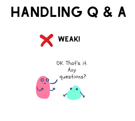
I’m going to save a tree. I’ll stop handing out business cards.
Do we really need business cards anymore?
I find that when I go out to meet people, I’m more inclined to exchange LinkedIn information. Other people I know exchange electronic contact info to stay in touch.
When someone tries to hand me a business card, I usually try to ward them off. I know I’m only going to throw it away later. It seems like a waste.
My compromise solution for next year is to only order a few cards. If someone demands one and I deem it necessary, I can hand one out. I’ll keep an eye on how many I hand out, and try to whittle it down to zero.
I’m thinking business cards may just be a bad habit that I need to break for the new year. Business cards seem like a holdover habit from a bygone era.
Or is there a compelling case for business cards that I’m not grasping?
Laura Bergells is a professional story finder. She writes, coaches, teaches, and speaks. Check out her online courses at LinkedIn Learning.
If you’re a LinkedIn Premium or Lynda.com member, these courses are free! If you’re not a member, you can either become a member or buy each of these classes à la carte.
I love working with talented professional designers. They can help you create slides that not only look beautiful, but really help enhance your presentation.
However, most of the time, I don’t have the luxury or budget to hire a design team to produce my slides. For many business presentations, slide design becomes a do-it-yourself effort.
When designing slides, I need to remember my limitations! I’m not a professional designer, so I need to keep my slides simple. And as luck would have it, simplicity makes for great slide design.
Ironically, simplicity isn’t as simple as it sounds. It often means using restraint. Holding back can be really difficult when you’re using slideware that offers you zillions of design options. Like a kid in a toy store, you can be tempted to play with all these distracting features — and forget to connect to your audience with solid content and excellent presentation skills!
And that’s a key concept when designing with simplicity — avoiding distractions. When you approach your slideware, try playing this eye-opening little game. Start by giving yourself some very restrictive rules.
To begin, let me give you a set of design rules that may seem really harsh. Remember, think of this as a game. Your goal is to design your presentation using 5 very spartan rules:
Use 1 font types and 2 font sizes, max.
Use black, white, and grey: no color on your slides.
No bullet points or 3D.
No more than 10 words on any slide.
No pre-packaged design templates, clipart, animation, & transitions.
That’s pretty harsh, right? Go ahead and give it a try. You’ll find that giving yourself some very restrictive rules can really open up your creativity. You may or may not like the way this presentation looks in the end, but this is only round one of the game. Save your presentation, and let’s try round two.
Open up your B&W presentation, and save it as another name — maybe something with Part 2 in it. Now, let’s loosen up the rules a bit. This time, you can follow these 5 rules, instead.
Use 2 font types and 3 font sizes, max.
Only one color other than black, white, and grey.
Use up to 3 bullet points — but on one slide only.
No more than 14 words on any slide.
No pre-packaged design templates, clipart, animation, & transitions.
That’s only a little less harsh, right? But notice what happens when you start from a place of restriction and gradually open yourself up to a few new features. You’ll start to see what’s really essential — and what might be distracting.
This approach is almost in direct opposition to what we see with most slideware. Instead of giving yourself access to every tool in your design toolbox, start by limiting yourself. Gradually, add a few techniques in each iteration.
For your third and final iteration, go a little crazy. Open up your design restrictions to these rules:
Use up to 2 font types and 3 font sizes.
Use unlimited amounts of color on your slides.
Limit yourself to seven bullet points on three slides.
You can put up to 20 words on any slide.
Still no pre-packaged design templates, clipart, animation, or transitions.
Try this exercise. You’ll discover some surprising insights when you do. You may even find that you like your black and white presentation so much, you’ll be inclined to keep it!
Remember, simplicity is often best in slide design. You may feel that it’s impossible to keep to the stringent rules I’ve outlined. But, your mind will love a creative challenge. And remember that giving yourself design limitations may help you design a more polished presentation.
For close to two decades, I take an almost-daily walk near my office. It helps the creative process to get out and clear my head. My office is located in an old forest. A creek runs through it, creating a sizable gully. I’ve seen deer, coyotes, rabbits, and all sorts of birds on my constitutional.
As one of the more civilized creatures, I walk on the sidewalk that cuts through the forest. No sense muddying my shoes on the way to and from work.
A few weeks ago, something new caught my eye on my daily walk. Someone had crawled down into the depths of the gully to place a red sign on a tree. The bright red spot caught my eye and raised my curiosity.
The sign, as seen from the sidewalk
Squinting, I gathered that there were words on the sign. However, the sign was too far down the hill for me to read. An innately curious person, I simply had to know what the sign was trying to communicate. In a typical January, the forest would be filled with drifts of snow, making it near impossible for me to get close to the sign. Even so, the forest floor was filled with slick leaves, so I half slid down the gully to get a closer look. Halfway down, I snapped another photo:
Sign, halfway down the hill, with zoom.
Curses! I still could not read the sign. Determined, I continued to slide down the hill until I got a few feet away from the tree.
I'm going to be prosecuted.
I felt entrapped. Twenty years, and I never once think to wander down a steep hill to go into the forest. A bright sign inflames my curiosity, and boom. I’m a trespasser.
Vexed, I trudged back up the slippery hill. A Pileated woodpecker gave me a stern lecture, then banged his head on a rotted tree top. The judge banged his gavel. I had been dismissed. Case closed.
What three presentation lessons had I been reminded of from my foray into the forest?
The unexpected will rivet audience attention. Breaking a pattern is a very basic way to grab attention. I was accustomed to seeing only forest: the red sign caught my interest because it was different than what I had expected to see. How can you break a visual or sensory pattern in your next presentation to grab attention and get your audience to take action?
Be careful with negative instructions. If you don’t want your audience to do something, don’t even put the idea into their heads. If I tell you to NOT think about woodpeckers right now, guess what you’re going to do? You’re visualizing woodpeckers right now, aren’t you? Yet, you had no intention of doing so… until I told you NOT to do it.
Take words seriously. If you want me to take your words seriously, how about making your font size huge and clearly visible? What about placing your sign (or your PowerPoint) almost smack in front of me, instead of making me peer down a gully or around a post or from the side or through someone’s head?
I’m pleased to report that the woodpecker let me off with only a warning. I will be doing no serious time or paying a hefty fine for my trespass — other than scraping what appears to be an unpleasant mix of mud and coyote dung off the bottom of my shoes.
I like meat. Grilled, stewed, roasted — properly prepared, good cuts of meat are delicious.
But when it comes to presentation, how much meat is too much meat?
I was enjoying a friendly discussion with another meat-loving chum. We agreed that while the meat prices are very good at a local grocery store, we seldom shop there. Why?
The presentation of their meats.
First, think of the butcher shop portion of your local grocery store. Here, meat is presented like a spectacular array of precious jewels. A butcher, dressed in white, lays out glistening chops on crisp ice behind a shiny glass counter. In most cases, you see more white space (ice, counter tops, aprons) than you do red space (the actual product.)
Now, think of how meat looks at a mega-grocery store. You see piles and piles of flesh, squeezed into tight plastic containers, piled on each other in vast layers like too many rats in an unclean cage. Almost all red space, almost no white space.
Too much red space makes me squeamish. It makes the meat look like what it is — grotesque piles of dead flesh. It looks cheap and unappetizing.
Most people buy meat from the bloody flesh pile. They seem to care more for the price and convenience than the food shopping experience or interacting with a knowledgeable butcher. I get it — meat & food isn’t that important to most people.
If you’re selling a product that most people are content to buy from a bloody flesh pile, how might you fill a niche for those who don’t particularly care for that experience?
Eliminate some red space. Add more white space.
In a grocery store, you’ll see a clean, white butcher shop. Apple distinguished its products and stores to be an almost all-white space experience in what is increasingly a cluttered RadioShack world of components and bargain basement bins. And think of the feeling you get when shopping for jewelry at a crowded and cramped pawn shop vs. oh, let’s say, Tiffany’s.
It’s all about the white space.
How else can you add white space to the presentation of your products and services to heighten the sensory experience of the customer?
Today, if you Google “Death by PowerPoint”, you’ll see 980,000 results — only about 2.7 times as much as 2008. The year-to-year death rate appears to be dropping.
The PowerPoint death rate keeps climbing — but at a much slower pace than 2007-2008.
Why do you reckon the rate of death mentions is slowing? With more people participating in social media channels, the opportunity to mention this oft-parroted phrase is increasing. Could it be that the phrase itself is becoming passe?
Yet why are overall mentions still increasing? Almost a million search returns – goodness! What will 2010 yield? And what will finally put an end to the carnage? 🙂
If you’re an overly confident speaker, you might have a big problem connecting with a modern, tech-savvy audience. (Especially here in the American Midwest!) In an era of quickly produced, less-than-polished user generated content — your confidence might seem inappropriately over-the-top.
Here are 3 quick and completely insincere ways to tone down any over-confidence you may have as a speaker or presenter.
Toss in filler words. A few, “ums and ahhs” and nervous shuffling can go a long way to instill the idea that you’re thinking about what you’re saying. You’re not glibly reciting a speech. You’re not absolutely convinced that you are unequivocally correct. You’re open to starting conversations and creating a dialog. Your social awkwardness in public speaking indicates that you’re thinking. That you’re concerned. That you care enough to be nervous. Audiences warm to this kind of humility.
Ugly up your PowerPoint slides. Nothing says, “I’m overly image conscious” like professionally designed PowerPoint presentations. When it looks like a presenter spent 80 hours in meetings with a team of designers, writers, and speech coaches to deliver a one-hour presentation — that’s the take-away. That’s what the audience will talk about behind the speaker’s back. The message won’t stick when all people talk about is how pretty the slides were and how Hollywood the storytelling was.
Dress out-of-sync. I watched a multi-millionaire give a presentation to 200+ business people. The audience? In modern business attire. The presenter? In a sad, schlumpfly suit from the 1980’s. The audience LOVED him. Think they merely tolerated his eccentric garb because he was rich? Guess again. I also watched a junior software engineer wearing an unpressed polo shirt and lumpy khakis present to a board wearing business suits. They ADORED his presentation, too.
If you’re an awkward or eccentric speaker, rejoice. This is your time! Embrace your humility! Hug your weirdness!
And if you’re a con artist, your audience will likely see through your naked attempts to “Aw, shucks it up” for them. After all, this is the age of authenticity and transparency — two achingly glorious buzzwords that shine a bright, unflattering spotlight on slick over-confidence and transparently phony faux-humility mannerisms.
Those were four words on four slides in a 15 minute PowerPoint presentation I witnessed last month. The remaining 700 slides in the presentation each had one word on them, as well.
OK, I’m exaggerating. There couldn’t have been 700 slides in that presentation.
But it seemed like it.
In the presentation I saw, random buzzwords that the speaker used in his narrative kept fading in-an-out of the PowerPoint slides projected behind him. Oh-so-slowly.
After a few minutes, I blinked, shook my head, and looked away. I was getting too mesmerized by the slow word parade.
I was looking for meaning in those words. I was looking for context. There wasn’t any.
After looking off to the right for a few moments, I focused on merely listening to the speaker while I stared at a blank wall. The presenter was telling a story about a problem his customers had, and how his product helped solve it.
It wasn’t a half-bad story, so I turned to look at the speaker.
Then, I saw it.
synergy?
I grimaced. I had to look away again.
Since this presentation, I’ve seen a few other slow-word-parade style presentations. I suspect presenters create this style as something of a mood board to set the tone for the presentation. It can be easier and cheaper to toss word salad at people than to craft a story and work on polishing the delivery.
Personally, I find this word-mood board style of presentation design distracting and disturbing. It was hard for me to focus on connecting with the speaker or his story. I found myself thinking that he would have been much more effective with absolutely nothing in the background.
I’ve seen this technique a number of times this year. Let’s hope this a trend that will, uh — fade quickly!
What are better ways to set the mood for your presentation?