Design your slides with accessibility in mind.
(I was trying to read small black text on a gray-radiant background earlier this month. I gave up.)
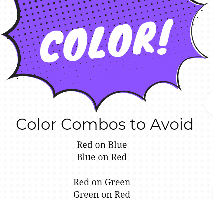
One accessibility violation I see in many slide designs involves the use of color.
❌ Red text on a green background? Yikes!
❌ Green text on a red background? Don’t!
❌ Red text on a blue background? Shudders!
❌ Blue text on a red background? Just…no.
But why not?
Remember, people with red-green color blindness can’t see red on green.
And people with photosensitivity may feel ill with blue/red color combos.
Bonus: When you design with accessibility in mind, you make your slides lovelier for everyone!
As we design slides, we’ll want to check our colors to make sure they’re accessible to all.
You can check your text and background colors for accessibility here. https://webaim.org/resources/contrast…
While this site 👆👆👆 was designed with WEB accessibility in mind, you can use it for SLIDE DESIGN, as well.
Laura Bergells is a professional story finder. She writes, coaches, teaches, and speaks. Check out her online courses at LinkedIn Learning.
If you’re a LinkedIn Premium or Lynda.com member, these courses are free! If you’re not a member, you can either become a member or buy each of these classes à la carte.