Categories
PowerPoint Presentation Sway video

Microsoft Sway: give it a try, avoid the hype

https://youtu.be/pcg6DGO9hpI?list=PLXPr7gfUMmKyE22-YpbgcDfr2SXEO7-qX

Microsoft Sway is now freely available online. If you’re a story teller, check it out. Take a few minutes to watch the Microsoft tutorial video.  It will give you a broad overview of what Sway is and how you might use it. Then, go monkey around with it a little. It’s at Sway.com.

Whatever you do, don’t read too much about Sway right now. Avoid tech and business journals in particular. I’ve read too many online posts about Sway that I’ll politely call “myths mixed in with enough facts to be confusing”.

Three Microsoft Sway Myths Widely Perpetuated in Media Hype

Myth 1: Sway is a PowerPoint killer! Nope. It’s not. In fact, one of the first activities the Sway interface challenges you to do is to upload a PowerPoint presentation. Hmm. Unless Sway kills PowerPoint by telling you to use PowerPoint, how is it a PowerPoint killer? At its core, Sway is an online storytelling tool. PowerPoint is presentation slideware. The two coexist peacefully.

Myth 2: You need to download an app to use Sway! Uh-uh.  You can go directly to Sway.com and create a online story, right now. All you need is a computer with internet access and a Microsoft user name + password. No download is necessary, although if you like that kind of thing, go for it. You can go app happy at the Microsoft store.

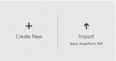
Myth 3:  You can’t create original content in Sway! Sigh. I lost track of how many times that I read that you MUST upload a Word document, PowerPoint presentation, or PDF — otherwise Microsoft Sway is useless.  Those writers must have missed the giant “Create New” button. Fact: you can start a story from scratch. (I did that for my very first Sway story.)

Sway is not a PowerPoint Killer
These are the first two activities you’ll see in Sway. And yet, it’s a Powerpoint killer? And you can’t create new content? Phooey.

Go ahead and give Sway a try. Avoid reading about it and have a little fun actually playing with it. Bring along a Word document, PowerPoint presentation, and a PDF file to see what Sway will do with them when you upload them. You might like it, hate it, or feel indifferent: but if you play with it for a half hour, you’ll probably have 29 more minutes of experience with Sway than many of the reporters who wrote about it.

Have some fun. Play with Sway. You can form your own cursory opinions, free from confusing media hype and spin.

Categories
Education fun PowerPoint Presentation

Do you want me to bore you?

Tiger Yawning

“I can bore you to death with a couple hundred PowerPoint slides for the next hour, or we can have a discussion and make this fun and interactive,” said the speaker.

Seriously. Those were the first words out of his mouth. The audience of around 50 just sat there, including me.

After about 5 silent and stunned seconds, I was the first to speak.

“Let’s make it fun and interactive,” I said.

“Oh, good,” said the speaker. “I was hoping someone would say that.”

He flipped off the projection unit that showed the title page of his slide deck. He began interacting with the audience. He held our attention for over an hour. I walked away learning quite a bit and enjoyed the give-and-take between speaker and audience members.

But it left me wondering. Why would he give us a choice? And why would anyone choose the boring option?


Categories
PowerPoint PowerPoint Presentation Presentation

Who else remembers a world before PowerPoint?

Who can remember the first presentation they ever gave using PowerPoint? Can you remember with any specificity, or is PowerPoint so ubiquitous that you can’t really remember?

For those of use who are over 23 years of age — we are not PowerPoint natives. Some of us can remember a time before PowerPoint existed…and we gave presentations, anyway.

My first PowerPoint… it was in the early 1990’s. As a leader of a corporate IT user group, I was charged with giving the team’s recommendations to the executive staff.

I gave my first PowerPoint presentation a yellow background. I used few words — mostly pictures and headlines — and picked the “dissolve” transition between each slide. I gave it on a computer, as the executive staff circled around the monitor, amazed by the potential to use this whiz-bang new technology to tell a convincing story.

I remember a lot of “oooooh’s and aaaah’s”, followed up by “Neat. How’d you do that? Can we do that for sales? How about training?”

The executive staff approved our proposal. And PowerPoint became a global standard for business presentations.

Are you a PowerPoint native? Where were you when you delivered your first PowerPoint presentation?

Categories
design PowerPoint Presentation

Slide Design: Try this ‘Simple’ Game…

I love working with talented professional designers. They can help you create slides that not only look beautiful, but really help enhance your presentation.

However, most of the time, I don’t have the luxury or budget to hire a design team to produce my slides. For many business presentations, slide design becomes a do-it-yourself effort.

When designing slides, I need to remember my limitations! I’m not a professional designer, so I need to keep my slides simple. And as luck would have it,  simplicity makes for great slide design.

Stingy Design Restrictions

Ironically, simplicity isn’t as simple as it sounds. It often means using restraint. Holding back can be really difficult when you’re using slideware that offers you zillions of design options. Like a kid in a toy store, you can be tempted to play with all these distracting features — and forget to connect to your audience with solid content and excellent presentation skills!

And that’s a key concept when designing with simplicity — avoiding distractions. When you approach your slideware, try playing this eye-opening little game. Start by giving yourself some very restrictive rules.

To begin, let me give you a set of design rules that may seem really harsh. Remember, think of this as a game. Your goal is to design your presentation using 5 very spartan rules:

  • Use 1 font types and 2 font sizes, max.
  • Use black, white, and grey: no color on your slides.
  • No bullet points or 3D.
  • No more than 10 words on any slide.
  • No pre-packaged design templates, clipart, animation, & transitions.

That’s pretty harsh, right? Go ahead and give it a try. You’ll find that giving yourself some very restrictive rules can really open up your creativity. You may or may not like the way this presentation looks in the end, but this is only round one of the game. Save your presentation, and let’s try round two.

Open up your B&W presentation, and save it as another name — maybe something with Part 2 in it. Now, let’s loosen up the rules a bit. This time, you can follow these 5 rules, instead.

Loosen Up Design Rules

  • Use 2 font types and 3 font sizes, max.
  • Only one color other than black, white, and grey.
  • Use up to 3 bullet points — but on one slide only.
  • No more than 14 words on any slide.
  • No pre-packaged design templates, clipart, animation, & transitions.

That’s only a little less harsh, right? But notice what happens when you start from a place of restriction and gradually open yourself up to a few new features. You’ll start to see what’s really essential — and what might be distracting.

This approach is almost in direct opposition to what we see with most slideware. Instead of giving yourself access to every tool in your design toolbox, start by limiting yourself. Gradually, add a few techniques in each iteration.

For your third and final iteration, go a little crazy. Open up your design restrictions to these rules:

  • Use up to 2 font types and 3 font sizes.
  • Use unlimited amounts of color on your slides.
  • Limit yourself to seven bullet points on three slides.
  • You can put up to 20 words on any slide.
  • Still no pre-packaged design templates, clipart, animation, or transitions.
Go nuts with design

photo by Euromagic

Try this exercise. You’ll discover some surprising insights when you do. You may even find that you like your black and white presentation so much, you’ll be inclined to keep it!

Remember, simplicity is often best in slide design. You may feel that it’s impossible to keep to the stringent rules I’ve outlined. But, your mind will love a creative challenge. And remember that giving yourself design limitations may help you design a more polished presentation.

Categories
content ideas PowerPoint Presentation

Use super sticky notes for super sticky ideas

After a longish brainstorming session, I heard Mac Fowler quip, “I should buy stock in 3M.”

He was referring, I reckon, to a perceived uptick in the use of 3M’s ubiquitous sticky note. It was true that I had flung a pack of these little devils on the table during our annual aimWest planning meeting. I carry 3M Post-it notes almost everywhere.

I might go so far as to say I have a severe Post-it note addiction. And it’s not just the regular sticky notes.

I’ve quickly moved up to the Super Sticky. I can’t even consider buying the regular kind in my line of work.

post-it notes, sticky note

I do quite a bit of online content development. The sticky note is an indispensable tool for content developers and editorial calendar creators. If you’re brainstorming ideas with a team, give a different colored pack to every team member. We jot down ideas on sticky notes and slap them on the big editorial calendar that we keep on the wall (think of a giant grid sectioned off by time and editorial topics).

I recommend the Super Sticky notes over the regular stickies. Sure, they cost a bit more — but if you’ve ever been vexed by sticky notes losing their stick and falling like so many multi-colored snowflakes over your war room floor — you’ll easily see how these bad boys are worth the extra pennies. You can move them around several times — and they still stick.

We move Post-it notes around in content brainstorming sessions. A story headline idea that seemed perfect for, say, a July 6 online post may get usurped for a much larger breaking news story. We’ll move our originally planned story to another day.  The Super Stickies give an editorial team flexibility.

Further, I use the sticky note approach for quickly story boarding speeches and presentations. I’m not one to memorize speeches word for word, so I might rehearse a speech by staring at something like this:

post it note storyboard

Oh, sure, it looks like gibberish to you. But I can assemble a quick speech by arranging symbols that represent stories for my opening, main points, and closing. It doesn’t matter that you know what these little notes stand for. I know that when I see the guy with the top hat, that’s my cue to tell the story about that one time in New York when the guy with the top hat and tails got caught…

…well, you get the picture. This approach works for me. Way better than memorizing a script. Plus, the images and headlines I scratch are for MY head and MY rehearsal. I don’t have to subject an audience to PowerPoint. I can remember a series of pictures in my head way better than a prescribed set of words.

And even though Post it notes may line my desk, office walls, and car interior: I still get a little flak from my high-tech lovin’ friends. A few pooh-pooh my old tech Post-it note habit. With so many software applications available that emulate the sticky note, why do I persist in cluttering up my environment with low-tech paper and pen scribblings?

post it notTweet credit: Bruce Abernethy | @babernethy

My answer is simple: I like interacting with the physical world. I enjoy touching things beyond my keyboard and screen. The physical world inspires me.

I like to consider sticky notes as colorful, highly tactile playthings for work. Like Play-Doh or alphabet blocks, Post-it notes are fundamental toys for modeling ideas in the physical world.

It can be no coincidence that Play-Doh and alpahbet blocks also grace/litter my office… what colorful toys do you use for idea generation, collection, and management? How do you use them?

ps — to my knowledge, I own no stock in 3M. Nor have they paid me to write this post…

Categories
PowerPoint Presentation Twitter

PowerPoint Pet Peeve: The Passive Voice

Which sentence do you like better?

  • A PowerPoint presentation was given by the CEO.
  • The CEO gave a PowerPoint presentation.

Both sentences relay the same information. So why do you like the second one better?

  • The first sentence is longer. It uses the passive voice.
  • The second sentence is shorter. It uses the active voice.

When I listen to speakers who almost exclusively rely upon the passive voice, I go a little bonkers. Why?

Cascabel
Creative Commons License photo credit: Jacob Garcia

The passive voice is mushy and weaselly. It signals that the speaker is trying to hide something. When someone says, “Mistakes were made ,” I instantly want to spring up and scream, “By whom?”

If one more benefit shakes out of using Twitter, let it be a giant reduction in people using the passive voice. Active voice is shorter, swifter, and more powerful. It takes responsibility. It’s the stronger, nobler choice.

I have no idea why so many presenters use the passive voice. Do you?

And what are your grammatical presentation pet peeves?

(Of course, it might be a fun exercise to write your blog comments, exclusively using the passive voice. That might help me exorcise my peevishness!)