I like meat. Grilled, stewed, roasted — properly prepared, good cuts of meat are delicious.
But when it comes to presentation, how much meat is too much meat?
I was enjoying a friendly discussion with another meat-loving chum. We agreed that while the meat prices are very good at a local grocery store, we seldom shop there. Why?
The presentation of their meats.
First, think of the butcher shop portion of your local grocery store. Here, meat is presented like a spectacular array of precious jewels. A butcher, dressed in white, lays out glistening chops on crisp ice behind a shiny glass counter. In most cases, you see more white space (ice, counter tops, aprons) than you do red space (the actual product.)
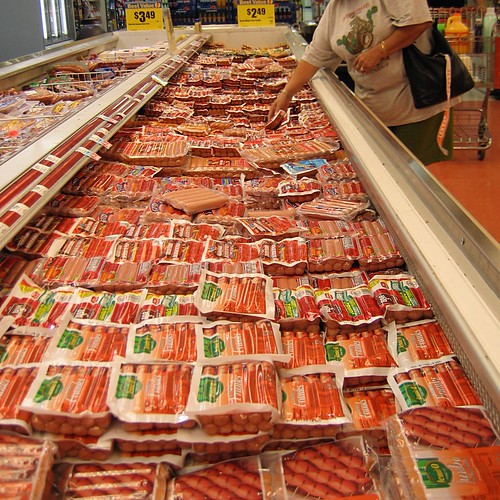
Now, think of how meat looks at a mega-grocery store. You see piles and piles of flesh, squeezed into tight plastic containers, piled on each other in vast layers like too many rats in an unclean cage. Almost all red space, almost no white space.
Too much red space makes me squeamish. It makes the meat look like what it is — grotesque piles of dead flesh. It looks cheap and unappetizing.
Most people buy meat from the bloody flesh pile. They seem to care more for the price and convenience than the food shopping experience or interacting with a knowledgeable butcher. I get it — meat & food isn’t that important to most people.
If you’re selling a product that most people are content to buy from a bloody flesh pile, how might you fill a niche for those who don’t particularly care for that experience?
Eliminate some red space. Add more white space.
In a grocery store, you’ll see a clean, white butcher shop. Apple distinguished its products and stores to be an almost all-white space experience in what is increasingly a cluttered RadioShack world of components and bargain basement bins. And think of the feeling you get when shopping for jewelry at a crowded and cramped pawn shop vs. oh, let’s say, Tiffany’s.
It’s all about the white space.
How else can you add white space to the presentation of your products and services to heighten the sensory experience of the customer?